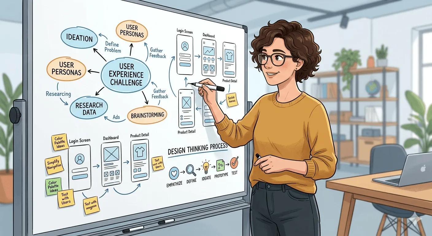


How should this form look?
Tactical question. The kind asked with total confidence — what color the button should be, which tab goes first, how many fields fit on one screen. Easy to answer. Easy to feel productive answering.
The form got built. It looked right.
But - Six weeks later, it didn't hold together with the rest of the flow…
Was the wrong question being asked — or was the right one never asked at all?
It was never about the screen tabs
Take a service transformation project. The ask that opened it was simple: "Which tabs should we have?"
Easy question. Except the real work underneath it had nothing to do with tabs. It was a multi-week process, spanning several teams, that nobody could complete in one sitting — and the actual question was:
How might progress feel staged and manageable, without asking any one person to carry the whole thing at once — while still giving people a way to collaborate, ask questions, and clear blockers as they move through it?
That's what the tabs were eventually holding. Not navigation for its own sake — a way to break a heavy, cross-team process into pieces small enough to move through with confidence.
Progress that survives real life
This process didn't happen in one sitting. People got pulled into other priorities mid-way. A decision would sit waiting on someone else for days before it moved again.
So when someone stepped away for a week — did their progress survive, or did they come back to a blank slate — right around the time their own memory of what they'd done had given up too?
The structure had to hold state, not just steps. Every stage had a way to save and return — so pausing never meant losing what had already been done. A quiet record sat underneath, capturing where things stood, so picking the work back up gave everyone the context they needed without re-explaining anything.
The goal was simple: coming back should feel like continuing, not restarting.
Get that right, and a heavy process stops feeling like a burden to survive. It starts feeling manageable — even, at moments, satisfying to move through.
A layer that might be needed in the journey
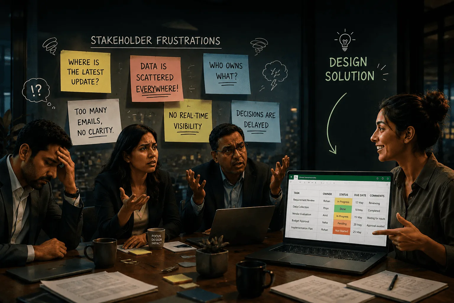
Here's what the tab question also missed entirely: this wasn't one person's job. It moved between roles — someone drafting, someone reviewing, someone signing off — and it stalled constantly, not because any screen was broken, but because nobody could see who was holding things up.
What if the flow itself showed people where things were stuck, instead of leaving them to chase updates over email?
That's what turned a set of tabs into an actual system: a way to collaborate built directly into the structure. Reviews, comments, and approvals weren't happening somewhere else, disconnected from the work — they were part of the same flow.
Remove that layer, and even a well-staged process still stalls. The blocker was never the interface. It was the silence around it.
The same question keeps coming back
A banking onboarding flow. A service transformation. A lifecycle tracking system.
Three different contexts. Three different rooms. Three tactical questions that all sounded reasonable on their own:
"How should this form look?" "Which tabs should we have?" "How do we display statuses?"
Each one got answered as asked. Each one actually needed something deeper — a way to move through complexity with confidence, a way to make fragmented steps feel like one coherent journey, a way for people to know where things stood without asking around.
Same challenge, three times over. Coincidence, or something more repeatable than that?
Where human judgment still leads
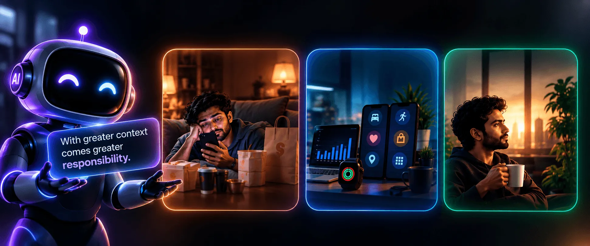
AI tools can generate a whole screen in seconds now — tabs, a status model, a stepper, a collapsible section, all of it — fast, competent, ready to ship.
So what's actually left for a person to decide?
A stepper, an accordion, a progress bar, a save-and-return button — get any of these wrong and it means real rework later. But that's still the surface. The harder call sits underneath: how much should someone see at once, when is it fair to ask them to decide something, what needs to stay visible, what can safely wait, and where's the right moment to let someone step away without penalty.
None of that gets solved by generating a screen faster.
It gets solved by someone who understands what the experience needs to hold, and how much structure is actually necessary to hold it — the same gap that shows up when "good enough" AI output quietly turns expensive article shows, once real users, not just requirements, meet the interface.
Tactical work fills in a structure. Strategic work decides what the structure has to hold. That was true before any tool could draft a screen in seconds. It's just easier to forget now that the fast part looks like the whole job.
What it costs to skip the real question
The tabs ship. Clean, tested, fast to build.
Three weeks in, someone gets pulled off the process mid-way — and comes back to find their progress gone, no record of where things stood. Someone else is stuck waiting on an approval the tabs never surfaced.
Nobody built it wrong. Everybody answered the question they were asked.
Three weeks saved building the tabs. How many weeks lost to people re-explaining themselves and chasing approvals that should have been visible from the start?
That cost never shows up in a sprint retro. It shows up months later, in the quiet, repeated friction nobody traces back to its source.
The architecture underneath the screens
That's experience architecture: not designing screens, but designing how progress feels — staged, resumable, light enough to carry, connected enough that nobody's stuck waiting in silence.
It moves in one direction, even when it doesn't look like it:
A need identified → a model for how the experience should feel and flow → clear direction → and only then, the screen itself.
The tabs, the steppers, the collapsible sections — all of it lives at that very last step. Necessary, visible, and often mistaken for the whole job. It's just where the earlier decisions finally become something you can click.
Next time a request lands as "how should this look?" — the real question sitting underneath it is what does this experience actually need to hold? Answer that first, and the right design decisions — made with human judgment — point straight to the right UI components.
Screens aren't the answer. They're where the answer becomes visible — after someone has already decided what the experience needs to hold.